Okay, so I know the point of the K House is it's open, light and airy feeling, and covering the windows/walls with dark grey wallpaper is kinda crazy, but after 4 hours of cutting and folding craft paper, I'm loving it. I don't think the photos do it justice. My husband is going to laugh, but I think I'm actually going to have to read my camera's owners manual to learn to take better photos (who am I kidding, my husband doesn't read this).
I was inspired by this photo of Graham & Brown's Gradient Purple Wallpaper. The craft paper is cut to size and folded to hold it in place. The fireplace paper is taped together but there is nothing adhering to the house so it can be easily removed. Here are some shots from around the room.
The black dining room table top was in the scrap bin at TAP Plastics for a few dollars, I had them cut down a clear cylinder tube and glued that on as the base.
Yea or Ney? I'd love to know what you think.
Furniture: Le Corbusier chairs from eTradersplace.com; TV - Hallmark ornament (Modern MC tip); TV stand is a Fisher-Price 1:16 scale coffee table; White couch is the Jasper Morrison sofa from "Bozart Kaleidoscope White Living Room" (check ebay for $45); clear glass coffee table is from "Bozart Kaleidoscope Green Living Room" (check ebay for $15); black/white lamps and pillows are from 2 "Bozart Kaleidoscope House Accessories" sets; metal and plastic end tables flanking Jasper Morrison couch - ebay find. Other Stuff: lamp in corner from AG Mini's blue room and purple room (MC tip); glasses/trays/food from Mighty World Town Cafe (MC tip).
Pages
▼
Tuesday, March 23, 2010
Kaleidoscope Home Tour
The Kaleidoscope House was the brainchild of architect, Peter Wheelwright, and artist/photographer, Laurie Simmons, and produced by Bozart Toys 2001/2002. I'm sure everyone is familiar with this shot, but for those who don't own one, or who are contemplating buying one, I wanted to take you on a little tour. So here it is out of the box in all of its glory.
The front door opens to a salon/foyer/dining room/lounge (depends on whose photos you're looking at). The left pink side wall is fixed, but the front has a sliding panel. If we go upstairs we find two bedrooms and connected by a Brady Bunch bathroom.
The room on the left, directly above the entrance, has purple umbrella wallpaper. If you climb the ladder you can see through the attic/crawl space/yellow skylight over staircase to the other room. The yellow wall on the front of the house is fixed to the frame, and the side panel slides for access. Through the open door is the bathroom, then second bedroom.
Walking back through the hallway, we reach the sailboat bedroom that is the exact same size as the umbrella bedroom. It also has the same fixed yellow wall in front and sliding panel on the side.
The Brady Bunch style shared bathroom that connects the two bedrooms, is about the size of a postage stamp. The Kaleidoscope House bathroom set is not 1:12 scale and barely fits in this bathroom. At best, it's a half bath with room for a sink and toilet but no tub or shower. In almost every K House I've seen the owner has opted to renovate one of the upstairs bedrooms into a bathroom, and use this for a closet/office/reading room. (I will post another time on the Kaleidoscope House accessories and furniture, but there is a great post on minimodern.blogspot.com about the bedroom sets and house notes.)
Heading back downstairs the great room has a floor to ceiling red fireplace with blue and pink fixed walls flanking it on the back. The upper level side walls are fixed but the lower side wall panels slide open for access. There is also a battery operated dome light under the balcony hallway.
The house does come with this oddly sized kitchen. If you line up one end with one doorway, it protrudes into the other doorway. The island is shorter but a little bit taller, and they both have a slight lean to them. The flooring on the lower level is grey with some interesting blue speckled stickers in the great room and the next room. The upstairs floors are white.
The last room has a fixed interior purple wall, but shares sliding panels with great room and entrance. I've seen this room used beautifully as an outdoor terrace space, but also as dining room/TV room/garage.
The roof has a rectangular skylight that runs the width of the house. The white plastic will eventually turn yellow with age, nothing you can do about that. The blue curved roof has a skylight above the staircase. Mine is warped so it just rests on the support posts and doesn't snap in place. Which is fine by me, because I remove it to take photos anyway, but if you are buying one, you may want to ask.
Well, I hope you enjoyed the tour. Next post will have furniture.
(Top image from Museum of Childhood which also has a rotational video of the Kaleidoscope House. All other images are mine which display my lack of photography skills. )
The front door opens to a salon/foyer/dining room/lounge (depends on whose photos you're looking at). The left pink side wall is fixed, but the front has a sliding panel. If we go upstairs we find two bedrooms and connected by a Brady Bunch bathroom.
The room on the left, directly above the entrance, has purple umbrella wallpaper. If you climb the ladder you can see through the attic/crawl space/yellow skylight over staircase to the other room. The yellow wall on the front of the house is fixed to the frame, and the side panel slides for access. Through the open door is the bathroom, then second bedroom.
Walking back through the hallway, we reach the sailboat bedroom that is the exact same size as the umbrella bedroom. It also has the same fixed yellow wall in front and sliding panel on the side.
The Brady Bunch style shared bathroom that connects the two bedrooms, is about the size of a postage stamp. The Kaleidoscope House bathroom set is not 1:12 scale and barely fits in this bathroom. At best, it's a half bath with room for a sink and toilet but no tub or shower. In almost every K House I've seen the owner has opted to renovate one of the upstairs bedrooms into a bathroom, and use this for a closet/office/reading room. (I will post another time on the Kaleidoscope House accessories and furniture, but there is a great post on minimodern.blogspot.com about the bedroom sets and house notes.)
Heading back downstairs the great room has a floor to ceiling red fireplace with blue and pink fixed walls flanking it on the back. The upper level side walls are fixed but the lower side wall panels slide open for access. There is also a battery operated dome light under the balcony hallway.
The house does come with this oddly sized kitchen. If you line up one end with one doorway, it protrudes into the other doorway. The island is shorter but a little bit taller, and they both have a slight lean to them. The flooring on the lower level is grey with some interesting blue speckled stickers in the great room and the next room. The upstairs floors are white.
The last room has a fixed interior purple wall, but shares sliding panels with great room and entrance. I've seen this room used beautifully as an outdoor terrace space, but also as dining room/TV room/garage.
The roof has a rectangular skylight that runs the width of the house. The white plastic will eventually turn yellow with age, nothing you can do about that. The blue curved roof has a skylight above the staircase. Mine is warped so it just rests on the support posts and doesn't snap in place. Which is fine by me, because I remove it to take photos anyway, but if you are buying one, you may want to ask.
Well, I hope you enjoyed the tour. Next post will have furniture.
(Top image from Museum of Childhood which also has a rotational video of the Kaleidoscope House. All other images are mine which display my lack of photography skills. )
Home Inspection
So, yes, I bought my KHouse back in December and have posted on it, twice. Sorry! We currently live in a 2 bedroom and the only space we had for it was on top of our dresser. It seemed like a good idea at the time, except the baby is still in our room, and the only time I can work on it is when she's asleep. Well, my better half helped me lug it into the kitchen, and for the past two days it has enveloped half of our table. I don't know how long this will last, but brace yourself, the tour begins...
I've been dreaming of owning a Kaleidoscope House since I first spied it on Modern MC's blog minimodern.blogspot.com back in August 2007. Three Christmas's later, this gem made it under my tree. Here it is in its entirety spread out on our living room floor. Sadly, in transit one of the plastic corner panels broke, and the prongs that snap the frame together had broken off. The ebay seller kindly offered to fix it, but I opted for a quick trip to TAP Plastics for glue and assembled it the next day after the glue dried.
Here it is as a pile of plastic and two hours later after my husband helped me assemble it. I was really surprised with the quality and ease of assembly. Next stop, tour.
Monday, March 22, 2010
Haute Dollhouse by Michael Williams
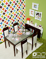
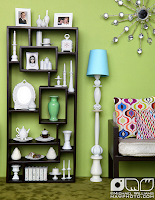
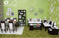
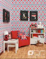
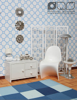
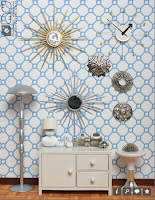
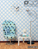
The other day CallSmall used some Barbie vases by Jonathan Adler which reminded me that I never posted these pictures... Michael Williams, MAWphoto.com, inspired by the Jonathan Adler catalogue built these dioramas, some of which were published in Haute Doll Magazine May/June 2009 issue. Barbie manages to score all of the cool modern stuff, but seriously, I wish my dollhouse looked like this.
The "OOAK Jonathan Adler diorama" features dining & living room furniture by Randall Craig Home (I blogged about this collection here) with custom cushions by Kolkman Kreations. I love the mirrored starbursts on wall which are Christmas ornaments Michael found at Hobby Lobby.
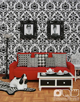
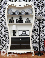
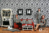
Of course I love the "Black & White Living Room", the wallpaper is fabulous and I love the use of beads as accessories on the shelf below the china.
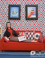
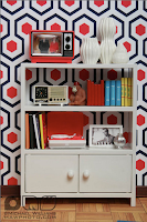
In the "RED, WHITE & BLUE living room" you'll recognize the Kaleidoscope Dollhouse and Re-Ment accessories on the IKEA dollhouse bookcase and tables.
The "LIGHT BLUE CIRCLES living room" has to be my favorite. I am a sucker for shiny objects. The George Nelson-style wall clock is made of metal ring, foam core circle, push pins and paper cutout hands. Be sure to check out all of the photos on Michael's flickr page as they have credits for where he found all of these goodies.
(all images from mawphoto.com Barbie Loves Jonathan Adler! flickr set and mawphoto.com on flickriver)